Duration: 3 months | Role: UX Design, Research & User Testing | Team: 5 members | Tools Used: Figma, WordPress, Adobe Creative Suite, Google Analytics
PROJECT CONTEXT
Imagine: You visit the website of an organization dedicated to assisting Chicagoland families affected by cancer, offering year-round gifts and essential support. However, you are unsure how to contribute through donations or volunteering.
You cannot find the appropriate information, and the content on the website is overwhelming.
Feeling uncertain, you may postpone and tackle the decision later. Alternatively, you might consider reaching out directly to the organization for clarification, increasing their support-related inquiries.
To resolve this issue, I collaborated with the Christmas Without Cancer Organization to redesign and implement their website.
SOLUTION:
I with my team successfully implemented the Christmas Without Cancer website in June 2021.
IMPACT:
Website traffic was increased by 25% after the redesign.
Reduced the support inquiries by 20% by adding enhancements and new features such as an FAQ section to the website.
Earned the trust of clients and users by conducting A/B testing resulting in unanimous agreement on the design from over 100% of users.
DESIGN PROCESS
GOAL
When we met with the organization's Co-Founder, she expressed the desire for a comprehensive website redesign, prompting us to decide to revamp the entire site.
Our goal is to enhance the digital presence by,
Organizing the information
Upgrade the aesthetics and usability
Simplify/Modernize the design/layout of the website!
Organizing the information
by conducting heuristic evaluation and content inventory
Heuristic evaluation and content inventory aided in comprehending the website's available content and identifying critical issues such as,
1. Disorganized Navigation
Incorrect placement of important categories led to numerous inquiries about the sign-up process.
Background color overpowered the content.
Non-essential category “calendar” in the navigation.
Missing utility navigation bar providing useful information about the website.
2. Missing Content
Some pages, such as "calendar," were empty.
The content in the “In the news” and "BIOS section" sections was disorganized and not updated.
3. No Design System
Dominant background colors overshadowing the content, snow effects hampering readability, and inconsistent font sizes lacking consistency
Upgrade the aesthetics and usability
by information architecture and usability testing
Leveraging the insights gained from the content inventory and heuristic evaluation, we identified necessary improvements for the website. By addressing content gaps, we conducted card sort testing to validate and optimize the navigation layout.
Conducted successful card sorting with participants, addressing category confusion in Mid-Fi and High-Fi Prototypes.
Utilized card sort results to iterate on navigation, developing mid-fi and high-fi prototypes for user testing. Employed a combination of A/B and first click testing approaches, conducting monitored and unmonitored tests with 49 participants divided into two groups. Carried out testing with 7 tasks to gather valuable insights.
From this
To this
During the usability testing, the prototype demonstrated seamless navigation for the majority of tasks, with only three specific tasks presenting some challenges that were identified for further improvement.
Task 1, which involved participants locating the FAQs, proved challenging as the majority of individuals mistakenly clicked on the "About Us" section instead of finding the FAQs.
Revise: Based on the insights gained, a strategic decision was made to list the FAQs within the "About Us" section while retaining their presence on the utility navigation bar, ensuring improved visibility and accessibility for users.
Task 2, involving finding the assistance application under the "Services" section, required improvement as users encountered difficulties.
Revise: To improve the ease of finding the assistance application, we made the decision to replace the "Services for Families" section with a more explicit "Application" section, ensuring that visitors can effortlessly locate and access the application without any confusion.
Task 3, involving finding the Mailing List on the website, required further improvement as users faced challenges in locating it.
Revise: To address the issue of the Join Mailing List option being overlooked by the majority of participants, we implemented a visual enhancement by adding a prominent dark line to the footer, drawing attention to the Join Mailing List section and improving its overall visibility.
Iterated prototype following usability testing
Simplify/Modernize the design/layout of the website
by designing the Sitemap, Design System, and High-fidelity Prototype of the website
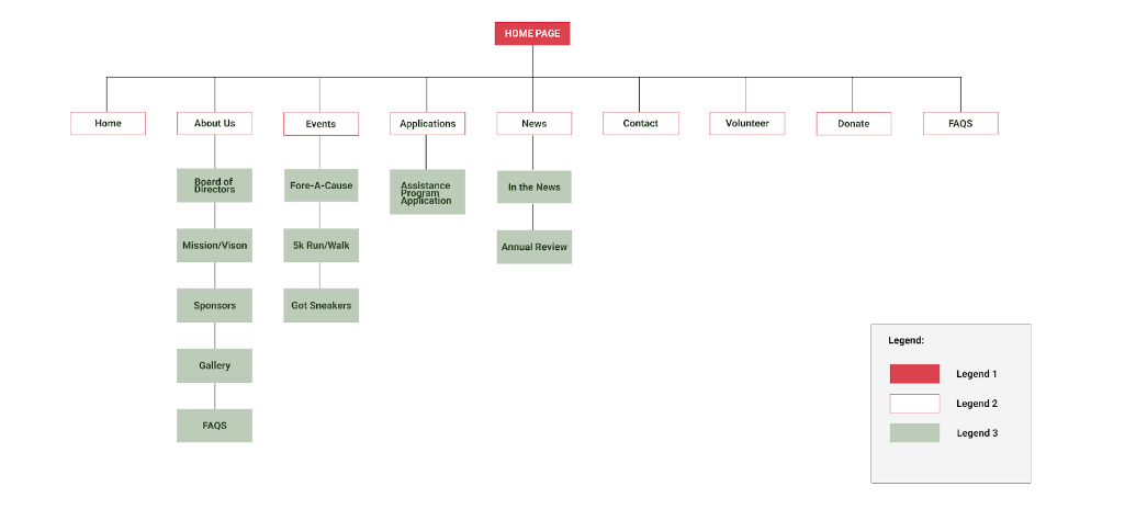
Developed a comprehensive sitemap that encompassed all the vital pages and navigation elements, providing a clear and organized overview of the website's structure and content hierarchy. This sitemap served as a valuable reference for ensuring effective information architecture and facilitating seamless user navigation.
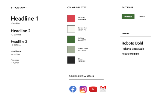
In response to the client's preference for a Christmas-themed design, we carefully selected subtle Christmas colors as part of the design system, ensuring that the website maintained a festive atmosphere while maintaining visual harmony and usability.
Achieving the Goal
by redesigning all the pages of the website
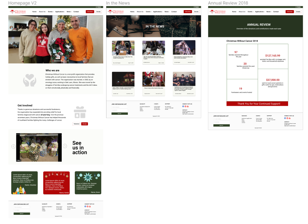
Homepage incorporates vision and mission statements as well as testimonials to encourage more individuals to join the organization.
Revamped the news section by replacing traditional links with visually appealing cards, offering a cleaner and more modern look.
Created an annual review that effectively highlights crucial information in a visually accessible manner, enabling easy comprehension and understanding of key details.
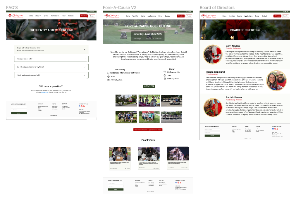
Developed an informative FAQ page that comprehensively addresses common questions, reducing inquiries to the organization.
Enhanced the Events page to showcase and highlight upcoming events and optimized the Board of Directors (BOD) page to provide comprehensive information about the directors.
IMPLEMENTATION (WordPress+ elementor)
Please check out the complete website at: christmaswithoutcancer.org
TAKEAWAYS
Pilot testing is essential: I realized that it is very crucial to conduct a trial run to identify and address any technical challenges before the actual testing phase. Ensuring that the questionnaire makes sense beforehand is important to avoid wasting users' time and energy, leading to more meaningful and effective user testing sessions.
Trusting the process: Due to time constraints, we adopted a non-traditional approach by initiating the design process with brainstorming sessions without immediately conducting user interviews and testing. This streamlined approach enabled us to optimize time management while still ensuring user-centric design throughout the entire process.
Meaningful experience: Recreating the website for the non-profit organization proved to be a profoundly meaningful and rewarding experience. From a business standpoint, I gained valuable skills in effectively engaging with stakeholders and incorporating their feedback into my work. On a technical level, I expanded my proficiency by learning and utilizing WordPress as a new tool. Personally, I embraced the realization that encountering challenges is inevitable and that the ability to adapt to changing circumstances is crucial for success.


